


A Change In Visual Style: Of Colour Grading “The Pillars of Creation”
- May 22, 2020
- 14 min read
As already blogged about during my Minor Project Module that preceeded FMP, the visual style I was aiming to use for “The Pillars of Creation” was as follows:

DoPs, Work and Colour Palettes
As such, it included visual references of Sci-Fi DoPs and their respective films, such as e.g. Hoyte van Hoytema (Interstellar, 2014, and Ad Astra, 2019), Wally Pfister, Jess Hall (Ghost in the Shell, 2017), and lastly, Bradford Young (Arrival, 2016). Back then, I analysed their visual style and colour palettes to have a better understanding of the different interpretations of the Sci-Fi genre and to find a template that can be emulated within our possibilities.
Summarising my findings back then, I then stated:
“A Change of Plans
However, during the course of our FMP preproduction meetings for Pillars of Creation last week – and the subsequent design ideas and choices of our art director Eline – we settled for a more futuristic, rather bright design that not only entails indirect lighting, but also a colour palette of whites, warm greys and lighter browns, only intermittently broken up by red emergency alert and dark colours.
Since this now clashes with the initial idea of a darker science fiction style dominated by blacks, blues, and dark greys (apart from few selected scenes) – and applied by the abovementioned DoPs Hoyte van Hoytema, Wally Pfister, and Jess Hall – I decided that I need to conduct further research into different lighting styles and colour palettes for Science Fiction to see whether I could make this work at all.
For this, I conducted a google research pertaining to bright colours in science fiction and quickly came across a blog article with the title “20 Churches That Look Like Spaceships”, deciding to have a quick browse through the images. And I was rewarded well beyond my imagination. For some of the images not only reflected the style Eline wanted to use for the set…
… they also reminded me of a Science Fiction film that I had not considered looking at in more detail for the purpose of my Minor Project: namely Arrival (2016) shot by the DoP Bradford Young.
Bradford Young and Arrival (2019)
I admire Bradford Young’s restricted colour palette and very controlled, softer but nonetheless natural lighting that reminds of an overcast day. There is a dominance of greys, darker whites and browns, while reds are sometimes reduced to browns or auburn. Also, there is a lot of silhouetted lighting and the focus isn’t as shallow as with for example Inception or Ad Astra.
I like the compromise of his imagery that manages to incorporate whites, browns and greys by still giving the film a darker, futuristic look. It fits both purposes of my Minor and FMP and will help me in understanding and applying more intricate lighting situations."
As you can see, the initial lighting style and visual concept of “The Pillars of Creation” has already undergone a bit of a change. But if the Covid-19 pandemic and the lockdown has taught us anything, plans do tend to change.
This held true for the initial shooting schedule for “The Pillars of Creation” and it also holds true for its visual references, as they continued to change in the following months before principal photography. During this module, the visual references changed along with a much closer realisation of what was feasibly achievable with the time and resources (here especially lighting equipment) at hand.
This came in addition to the developed visual preferences and tastes of both Has as Director and me as Director of Photography. This was further aided by additional research on various Sci-Fi films that we watched in order to gain a better understanding of the genre implications.
The Sci Fi Genres and Their Styles – A Minor (Project) Recap
Whilst I already blogged about the Sci-Fi genre style in extenso during my Minor Project (see my blog entry “The Sci-Fi Genre: Definition and Style”) and expanded on the broad genre distinctions conceived bv sociologist William S. Bainbridge who conducted a comprehensive and quantitative study on the three different expressions of the Sci-Fi genre:
The Hard Science Tradition (mostly concerned with scientific accuracy and logic)
The New Wave or Soft Science Fiction (mostly concerned with the social and sociological aspect)
The Fantasy Cluster (that combines elements of science fiction and fantasy and mostly consists of thought experiments),
I largely based my initial visual style on the second genre.
Researching Our Visual Style
However, despite mine and Has’ previous research on Sci-Fi films during the course of this degree, we felt that expanding our knowledge of the genre could not hurt, especially since we were producing a Sci-Fi film effectively on a no-budget level with a very small set (and thus very limited shot choices) to begin with.
What initially began as research into intriguing visual storytelling within very confined spaces, however quickly changed into more expanded research of the colour palette of independent Sci-Fi films, thus reinforming our options and ultimately our choices for the visual style and colour grade.
As such, we researched the following films in detail:
Snowpiercer (2013)
2001: A Space Odyssey (1968)
Ex_Machina (2014)
Moon (2009)
Having watched and analysed these films extensively, and re-evaluated our options, the initial list of films to draw from for visual references for our project finally changed from this:
Interstellar (2014)
Inception (2010)
Ghost in the Shell (2019)
Arrival (2016)
To this:
Interstellar
Inception
Ghost in the Shell
2001: A Space Odyssey
Ex_Machina
Moon
And as such, a new concept for our visual style was born:

A New Visual Style
With this new arsenal of visual references, we thus settled on the following visual qualities and references for “The Pillars of Creation”, attributing a certain colour palette to each scene.
As such, we finally settled on these visual references to be used for “The Pillars of Creation”:
Interstellar (2014) for the Beach Scene

Moon (2009) for the Scenes Preceeding Mark’s God Complex

Ghost in the Shell (2017) for Claire’s Scenes

Inception (2010) for Mark’s Plea for Life/Depression Scene

Ex Machina (2013) for his God Complex Scene

2001: A Space Odyssey (1968) for the Emergency Scene

Whilst this, naturally, already informed my lighting choices and my lighting plans, it was also obvious that the colour grading process in post should be geared towards creating (or at least enhancing) the colours in the images. Thus, it was only a natural and logical consequence to start researching into colour grading as well
Research into Colour Grading
Since I have picked up a job ever since the beginning of the FMP module, which will entail me seeing corporate films from beginning to end – and since I am very passionate about cinematography both in professional specialisation and in general – I wanted to be able to learn and apply the colour grade for “The Pillars of Creation” as well in my function as a DoP.
I wanted to do this because I felt that taking care of the colour grade in the edit would ultimately help me get a better understanding of the visual process and its opportunities in general, but also learn from my past mistakes further up the process line, thus re-informing my creative decisions for the future (and especially for my entrance into the industry).
Already back during Minor Project I was able to research a bit on the topic of colour correction in my blog entry “Final Cuts: Of Colour Corrections, Last Edits And The Results of My Learning”. As such, I have done a fair bit of colour correction for my camera tests.
However, back then and due to time constraints, I was not able to further pick up on colour grading, which is why I am grateful for the opportunity now to expand my learning on this matter.
Thus, during the past couple of weeks in lockdown, I had ample time to venture into the theoretical as well as practical research of colour grading. Since it was obvious from the start that I would be using DaVinci Resolve 16 as this is the version we currently have at our disposal, I primarily focussed my research on this version, although I branched out to tutorials on DaVinci Resolve 15 where feasible.
Because of this, I conducted my usual research at Youtube University and picked up a couple of promising tutorials on colour grading, one of the better ones being this one here:
However, further conducting research, I personally found that the most effective tutorials on colour grading were the ones provided by the MZED online library.
Here, following a purchase I made towards the MZED library – a one year subscription of online courses on filmmaking – I set about researching their online content that consisted of three really helpful courses:
Mastering Colour

Understanding LUTs: Theory and Application

The Definitive Guide to DaVinci Resolve

Whilst the last one was the most comprehensible and detailed (with it being a more than 9h-long tutorial), summarising its contents would exceed the scope of this blog. However, I will pick and choose pieces of knowledge from the abovementioned MZED resources and apply them in the following whenever feasible.
The Application of My Research on “The Pillars of Creation”
Lastly, with all our available clips on the timeline and the sound edit on the way, it was finally my turn to take over the edit and start the colour grade. Here, it is important to note for the further procedure that any colour correction had already been applied by our editor Chloe by the means of a colour correction LUT specifically designed for the BMPCC4k.
This correction LUT indeed worked wonders for most of the shots that we had assembled. I say “most” here, because they did not work entirely on shots containing green screen. Here, the slightest imbalance or "hot spots" (anything that was within 5% of its tolerance, as asserted by a false colour test conducted on the BMPCC4k before taking the shot) would be blown out of proportion, making the ensuing chroma key process a difficult task to achieve.
These shots needed manual adjustments to which I will return a bit later.
Colour Grading From Reference
Throughout this entire process, and since colours are a rather ephemeral and subjective phenomenon per se, I made it a habit to always have a reference image ready for the colour grade style that I wanted to go for, so that I would not fall into the trap of slowly diverging from a colour as I go through the process.
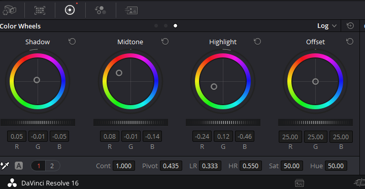
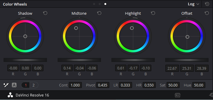
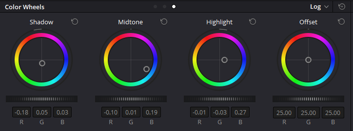
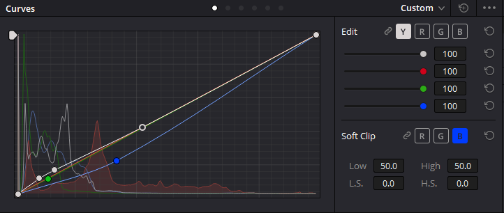
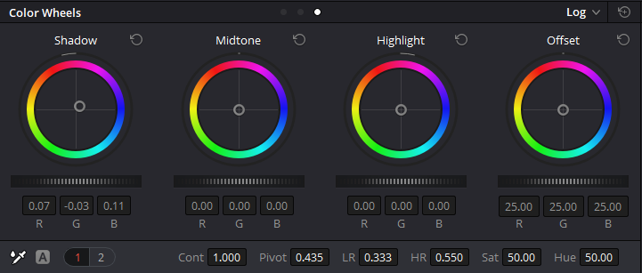
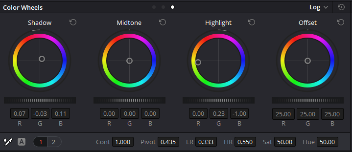
Now following the trusty method as shown in the tutorials above, I created an additional node for each method that I employed (which, in our case, was mostly using the Primary Colour Wheels and the Colour Curves), thereby assigning my implemented colour grades to them.
I then started approximating the colours from the relevant reference image by following the principle of the colour correction method I learned back in Minor Project. This I did by adjusting the Primary Colour Wheels: First the highlights, then the shadows, and finally the midtones.
After having done this, I then ventured into the Colour Curves Section and adjusted the intensity of each available colour – Yellow (Y), Red (R), Green (G), and Blue (B) – until the resulting image was as close (or identical) to my reference image as possible.


I then replayed the relevant clip several times over to ensure that the colour grade I just created was holding up throughout the clip itself. If the colour grade was then proving to hold up throughout the entire clip and not crush any blacks, blow out (or tinge) any highlights and/or create visual noise, I proceeded onto the next one, slowly working myself through the timeline.


Once an entire scene with a particular colour grade was done, I then returned to the beginning of that scene and ensured that the colour grade was similar across all clips - this was especially important for the red emergency scene as this was the most colour grade heavy scene in the entire piece.
The Emergency Scene
This scene was one of the more ambitious ones for our script and required a lot of attention to detail not only during pre-production and production, but especially in the colour grade stage in post. As we wanted to implement the infamous style of the 2001: A Space Odyssey scene in which Dr Dave Bowman is entering the brain of HAL9000 and turning him off slowly, it was obvious that the colour grade would not only need to be recognisable, it would also need to be very consistent throughout the entire scene.
Usually within the industry, and in order to combat the issue of inconsistent colour grades, you would be creating a LUT (Look Up Table) and apply this across the shots or scenes that require it to make colour continuity across that scene more manageable.
For this, and within DaVinci Resolve, the usual way to go about it would be to create a LUT by right clicking on an already colour-corrected and colour-graded piece and exporting its settings as a LUT file with the “.cube”-suffix. After that, you would then apply that LUT to any clip that has the same lighting and exposure values by adding another node, right clicking that node and apply a LUT from the dropdown menu. Ideally, you would then only be left with minor tweaks to take care of.
Or so goes the theory.
Cause for this scene, the method above did not pan out as planned. Following my research on LUTs, and in creating the LUT, I chose the more complex 3D-LUT instead of the simpler 1D-LUT, thus allowing me more control as I would be able to alter a single RGB-triplet and thus allows for more precise colour grading.
However, as I started applying the LUT (even with a variation LUT just in case), I realised that – despite the fact that the exposure values and lighting situation are exactly the same in all of the clips – the grade I applied was so heavy that it would never stay the same across the clips. Either some of the blacks were being crushed in CUs, or the highlights tinged in others.
After another failed round of experimentation with the second LUT variation that I created, I realised that I would be better off creating the grades manually. As such, I set about my work and retrieved better results of it.


However, this scene was not entirely done yet. For the next problem waited around the corner once I turned my attention to the green screen shots within that scene.
Colour Grading with Green Screens
Here, it turned out to be a difficult balancing act between keeping the green screen equally lit and achieving the rather strong colour grade. But let me start at the beginning first before I get to my procedure.
As I learned from the course “Mastering Colour”, contrast should be the first element to adjust when colour grading: Here it is important to ensure that the highlights aren't clipped and the shadows not crushed during the process (a feat that can easily be gleaned from any histogram).
In our case, this has already been taken care of by the correction LUT. Hooray! Or so I thought. But that came with a disadvantage:

For if you have green in your image you need to be more careful playing around with contrast than with any other colour. This has to do with the fact that every colour has an inherent brightness to itself and that green – due to its wavelength – is usually (perceived) brighter than the other colours (there is a reason why plants use the green colour of chlorophyll for photosynthesis after all).
The specific wavelength is also the reason why our eyes are most sensitive to green as we have more green-receptive cones in our eyes. And even camera sensors have been built to mimic that sensitivity by extrapolating brightness from the green colour channel. So playing around with contrast too much in images containing green can easily blow up highlights.
And that was what happened with our correction LUT: Here, the issue was furthermore amplified by the fact that it blew up the highlights which were not visible in the flat output that the LCD display showed us on set:

So how did I solve this issue?
In order to amend this issue, I followed the procedure that was presented in a blog written by Juan Melara:

Here, I set the settings for colour space to “BMD Pocket 4k Film Gen 4” and gamma to “BMD Video Gen 4”, then manually adjusted the highlight in the green screen by adjusting the highlight colour wheel until the blown out bit of information either fit (or at least approximated) the rest of the green screen, which helped alleviate the problem for the colour grade further down the line.


This was further aided by the fact that we were filming in Blackmagic RAW with a compression rate of 3:1, which gave me quite a wiggle room to work with that proved to be massively helpful with the colour grade further down the line (even if it did not solve all issues).
For I found out that the green screen that we used had significant parts of blue in it, which made it difficult to tone down the blue light of the LED strip light underneath the table (which was – according to the manufacturer and the BMPCC4k's LCD display – clean white light…) and thus sadly needed to be kept in order to allow for the chroma key to work.
Finishing Touches
Finishing the rest of the colour grade for the entire sequence that we plan to submit, I need to point out that his last scene – that we called the "God Complex Scene" and that entailed Mark’s development of a god complex, his fall from grace, and ultimately his sacrifice – was not colour graded apart from adjustments for the reaction shots of Anima and the close up of his eyes in order to make them match the rest of the footage
This is because I put a lot of time and effort into lighting this scene and it ended up looking exactly how I imagined it. Whilst I attempted to tweak some shots slightly to see where it would take me, I found that I was destroying the shots and the lighting (especially the fall-off that I love so much) more than I did improve upon it, so I left these scenes as they were and instead adjusted the rest of the scenes, resulting in some of these images:


Lastly, with this colour grade finished, I was rather proud of my learning and the results therein. Whilst it might not be perfect in every aspect – the night scene right before the emergency scene is not graded to my satisfaction and I need to read up more in order to gain new inspiration and insights in how to solve this issue – I’m happy with the outcome of the emergency scene for the time being.


Looking neat, eh?
References:
AbelCine Education System. (n.d.) Understanding LUTs: Theory and Application. [online] Available at: https://www.mzed.com/courses/understanding-luts [Accessed on 16 May 2020].
Blackmagic Design. (2018) DaVinci Resolve 15 – The Art of Colour Grading. [online] Available at: https://www.youtube.com/watch?v=jo0YcNRlrNA [Accessed on 1 May 2020].
Bong, J. (2013) Snowpiercer. [DVD] South Korea and Czech Republic: Snowpiercer et al.
Garland, A. (2014) Ex_Machina. [DVD] USA and UK: Universal Pictures et al. Image taken from: https://thecriticalcritics.com/review/wp-content/images/ex_machina-still_2.jpg [Accessed on 16 May 2020].
Hartle, S. (2019) Cinematographers, their Work, And Colour Palette. [online] Available at: https://sveahartle.wixsite.com/sveaexmachina/single-post/2019/10/19/Science-Fiction-Cinematographers-Their-Work-and-Colour-Palettes [Accessed on 16 May 2020].
Hartle, S. (2019) Final Cuts: Of Colour Corrections, Last Edits And The Results of My Learning. [online] Available at: https://sveahartle.wixsite.com/sveaexmachina/single-post/2019/11/22/Final-Cuts-Of-Colour-Corrections-Last-Edits-and-the-Results-of-My-Learning [Accessed on 16 May 2020].
Hartle, S. (2019) The Sci-Fi Genre: Definition and Style. [online] Available at: https://sveahartle.wixsite.com/sveaexmachina/single-post/2019/10/14/The-Sci-Fi-Genre-Definition-and-Style [Accessed on 16 May 2020].[CG1]
Jeven Dovey. (2018) Cinematic Colour Grading Beginner’s Guide. [online] Available at: https://www.youtube.com/watch?v=KTul78zjL64 [Accessed on 1 May 2020].
Jones, D. (2009) Moon. [DVD] USA and UK: Sony Pictures Classics et al. Image taken from: https://www.imdb.com/title/tt1182345/mediaviewer/rm1031943424 [Accessed on 16 May 2020].
Kenchington, O. (n.d.) Mastering Colour. [online] Available at: https://www.mzed.com/courses/mastering-color [Accessed on 1 May 2020].
Kenchington, O. (n.d.) The Definitive Guide to DaVinci Resolve. [online] Available at: https://www.mzed.com/courses/the-definitive-guide-to-davinci-resolve [Accessed on 9 May 2020].
Kubrick, S. (1968) 2001: A Space Odyssey. [DVD] USA and UK: Metro-Goldwyn-Mayer and Stanley Kubrik Productions Images taken from: https://www.imdb.com/title/tt0062622/mediaviewer/rm1891531008 [Accessed on 16 May 2020].
Learn How to Edit Stuff. (2018) DaVinci Resolve 16 Basic Colour Grade Tutorial. [online] Available at: https://www.youtube.com/watch?v=t8lXqB_4lZM [Accessed on 1 May 2020].
Melara, J. (2012) Recovering Highlights with Davinci Resolve. [online] Available at: https://juanmelara.com.au/blog/recovering-highlights-with-davinci-resolve [Accessed on 21 May 2020].
Nolan, C. (2010) Inception. [DVD] USA and UK: Warner Bros., Legendary Entertainment, and Syncopy Image taken from: https://www.imdb.com/title/tt1375666/mediaviewer/rm973442560 [Accessed on 16 May 2020].
Nolan, C. (2014) Interstellar. [DVD] USA, UK, and Canada: Paramount Pictures et.al. Image taken from: https://www.imdb.com/title/tt0816692/mediaviewer/rm2830056448 [Accessed on 16 May 2020].
Phenomenal Creations (2020) How to Color Correct in DaVinci Resolve 16. [online] Available at: https://www.youtube.com/watch?v=Uc4T79pXEAc [Accessed on 1 May 2020].
Sanders, R. (2017) Ghost in the Shell. [DVD] USA et.al.: Paramount Pictures et.al. Image taken from: https://www.imdb.com/title/tt1219827/mediaviewer/rm2772119552 [Accessed on 16 May 2020].
Villeneuve, D. (2016) Arrival. [DVD] USA, Canada, and India: Lava Bear Films et.al.
Waqas Qazi (2019) Color Grading Crash Course for Beginners in 2020 – DaVinci Resolve 16 Tutorial. [online] Available at: https://www.youtube.com/watch?v=gPZ4-CF_osk [Accessed on 1 May 2020].
Comments